Category: Uncategorized

  • How to Set Up a Menu File for Printing (Without a Reprint)

    How to Set Up a Menu File for Printing (Without a Reprint)

    A menu can look perfect on your laptop and still come back from the printer wrong — text shaved off at the edge, a header photo gone soft and pixelated, colors a shade duller than they looked on screen. Almost none of that is the printer’s fault. It traces back to how the file was built. Setting up a menu correctly is a short, repeatable checklist, and getting it right the first time is the difference between a three-day turnaround and a reprint. Here is how to prepare a menu file that prints the way you designed it.

    Start with the finished size, then add bleed

    Decide the trim size first, because everything else scales from it. The most common full-service format is 8.5 by 11 inches. A compact bistro menu or booklet is often 5.5 by 8.5 inches, wine and cocktail lists frequently run around 4.25 by 11 inches, and a table tent is typically 4 by 6 inches. Larger single sheets go to tabloid at 11 by 17 inches, which folds down to a four-page 8.5 by 11. Folded formats have their own math: a tri-fold built on a letter sheet gives you three panels of roughly 3.67 inches each, and the panel that tucks inside is usually cut a hair narrower so it folds cleanly, which is worth confirming with your printer before you design to the millimeter.

    Once the trim size is set, add bleed. Bleed is extra artwork that extends past the cut line so that when the guillotine trims the stack, no sliver of white paper shows at the edge. The standard is 0.125 inch, about 3 mm, on all four sides. That turns an 8.5 by 11 menu into an 8.75 by 11.25 inch document. Just as important is the safe margin on the inside: keep text, prices, and logos at least 0.125 to 0.25 inch in from the trim so nothing critical lands near the blade. Commercial trimming carries a small tolerance — a fraction of a millimeter of drift across a tall stack is normal — and the safe margin is what absorbs it.

    Get the resolution right, or the photos will soften

    Resolution is measured at the actual printed size, not at whatever the image happens to be on screen. The working standard for commercial print on coated stock is 300 DPI. Uncoated and newsprint-style stocks hide a little softness and can drop to roughly 200 to 250 DPI, large-format pieces viewed from a distance can run near 150 DPI at full size, and crisp line art or a vector logo wants far more, in the range of 600 to 1200 DPI, because hard edges reveal every jagged step. Whenever a logo is available as vector art rather than a photo, use the vector version; it stays sharp at any size.
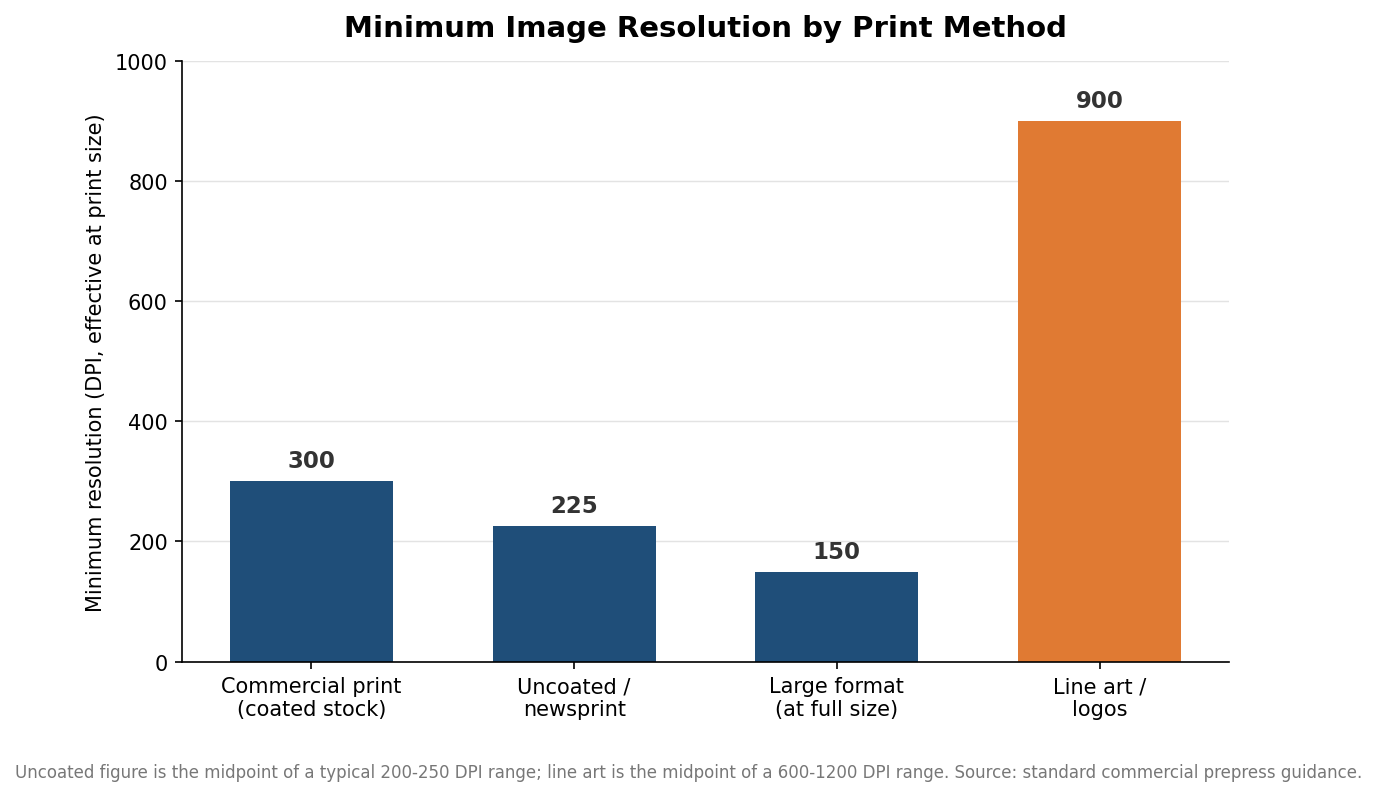
    Bar chart of minimum image resolution in DPI by print method, from 150 DPI large format to 900 DPI line art
    Minimum image resolution varies by print method; menus on coated stock target 300 DPI.

    The practical version of this rule is a pixel count. Multiply the printed dimension in inches by 300 and you have the minimum pixel size a photo needs. A full-bleed image across an 8.5 by 11 menu needs roughly 2,550 by 3,300 pixels; a 4 by 6 table tent needs about 1,200 by 1,800. If the photo a supplier sent is smaller than that, it will look fine on a phone and mushy on paper. Enlarging a small image does not add detail — it only stretches what is already there, so the fix is a bigger original, not a bigger export.
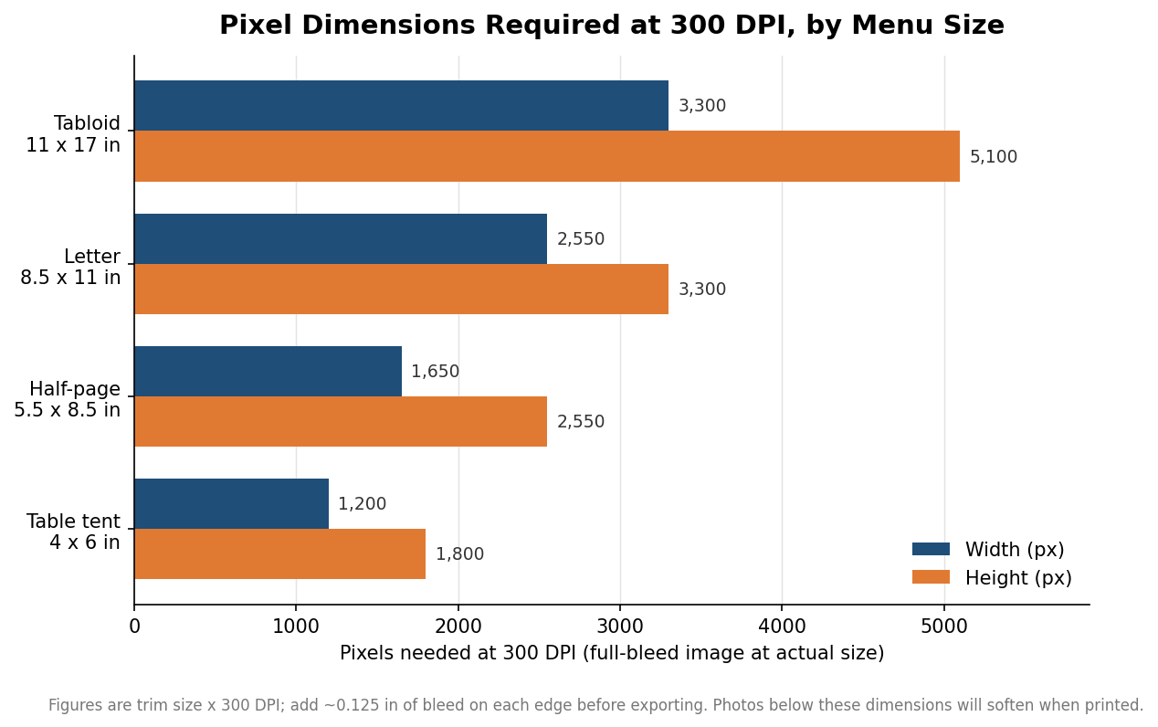
    Grouped horizontal bar chart of pixel dimensions required at 300 DPI for four common menu sizes
    Pixel dimensions a full-bleed photo needs at 300 DPI, by menu trim size.

    Design in CMYK so the color you approve is the color you get

    Screens build color from red, green, and blue light; presses build it from cyan, magenta, yellow, and black ink. Those are different color spaces, and their ranges do not fully overlap. If you design in RGB and hand off an RGB file, the press has to convert it, and bright blues and vivid greens in particular tend to come back duller or shifted. Set the document to CMYK from the start so you are looking at print color while you design, not screen color you will lose later. For the solid black backgrounds common on menus, ask your printer whether they want a rich black build rather than plain 100% K, which can look thin and gray over a large area. Finish changes the picture too: a gloss or UV coating deepens color and contrast, while matte and soft-touch laminations mute it slightly, so a proof on the actual stock and finish tells you far more than a proof on plain paper.

    Lock the fonts, export the right file, and proof before the run

    Two things break more menu files than anything else: missing fonts and the wrong export. Fonts should either be converted to outlines or fully embedded in the exported file, so the printer’s system does not substitute a different typeface and reflow your prices. For delivery, a press-quality PDF is the standard, and a PDF/X-1a or PDF/X-4 preset builds in the bleed, color handling, and font embedding automatically. Avoid sending a JPEG or PNG as the final file; those are screen formats and often arrive in RGB.

    Then read the proof carefully. Check spelling on every price and dish name, confirm the bleed runs to all four edges, and verify nothing important sits inside the safe margin. Most shops quote a lead time of about three to four business days after you approve the proof, so an error caught at proofing costs you minutes, while the same error caught after printing costs the whole run and another turnaround. Menus also change constantly with seasonal items and price updates, so build the file in clean, editable layers and keep the native file, not just the flattened PDF, for the next revision.

    A quick pre-flight pass

    Before you send anything, run one last check in plain terms: the document is built at trim size plus 0.125 inch of bleed on every edge; text and prices sit at least 0.125 inch inside the trim; every photo clears 300 DPI at its printed size; the file is CMYK; fonts are outlined or embedded; and you are exporting a press-ready PDF. Indicative menu pricing runs anywhere from well under a dollar per sheet at higher quantities to several dollars for premium stocks and finishes, but that math only works in your favor if the file prints right the first time. Five minutes of setup protects the whole order.
  • Custom Menu Sizes and Formats: Picking the Right One for Your Room

    Custom Menu Sizes and Formats: Picking the Right One for Your Room

    A menu’s size is not a cosmetic choice. It decides how much you can list without crowding, how the menu feels in a guest’s hands, how often you can afford to reprint, and whether the thing survives a spilled glass of red. Restaurants tend to default to whatever the printer assumes and discover the consequences later. This guide walks the common formats and stocks in the order that actually matters, from the workhorse letter size to the folded formats, the supporting inserts, and the paper and lamination that determine how long any of it lasts.

    The default, and when to leave it

    Letter size, 8.5 by 11 inches, is the size a printer assumes if you say nothing, and for good reason. It holds a full food menu for most restaurants, fits standard sleeves and boards, and photographs cleanly. If your list is average in length and you want one predictable, easy-to-source format, this is it.

    The moment your menu starts to feel cramped, the next step up is legal size at 8.5 by 14 inches. That extra three inches of height buys room for another section or more breathing space around each item without forcing you into a fold. Legal is the honest answer for a restaurant with a long single-page list that does not want the complication of panels, though you should confirm your menu covers and sleeves accommodate the taller sheet before you commit.

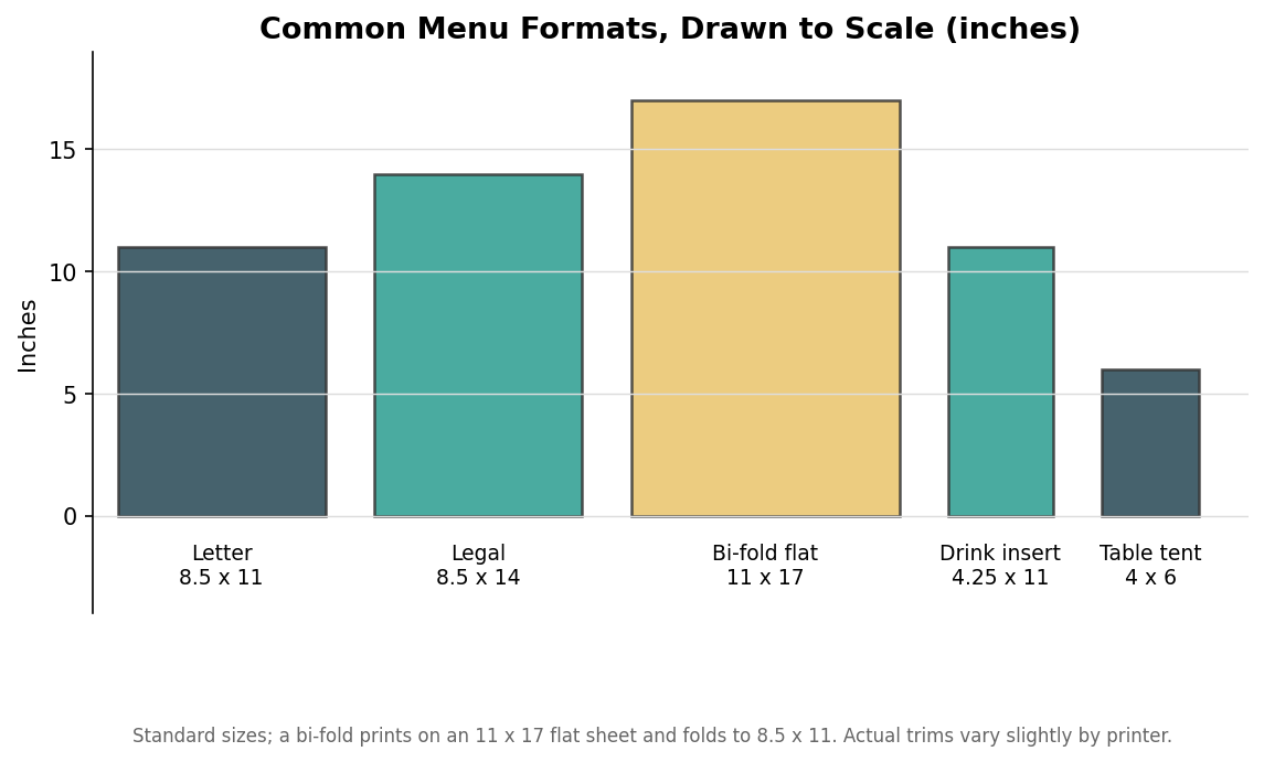
    To-scale comparison of common restaurant menu formats in inches from letter to table tent
    Common menu formats drawn to the same scale; the size differences are easier to feel than to read off a spec sheet.

    The diagram above shows the common formats drawn to the same scale, which makes the real differences obvious in a way a spec sheet does not. A table tent is genuinely small; a bi-fold’s flat sheet is genuinely large. Seeing them together is the fastest way to feel which one suits your table and your list.

    Folded menus: bi-fold and tri-fold

    When a single sheet will not hold everything, folding multiplies your space without enlarging the footprint on the table. A bi-fold menu prints on an 11 by 17 flat sheet and folds down to 8.5 by 11, giving you four panels in a familiar closed size. It reads like a slim booklet and suits menus that want a cover, an inside spread for food, and a back panel for drinks or the story of the place.

    A tri-fold works differently and trips up more people. It prints on a standard 8.5 by 11 sheet folded into three panels, but the panels are not all the same width: the panel that tucks inside is cut slightly narrower, often around three and two-thirds inches, so the menu closes flat instead of bulging. Design each panel as its own page, keep critical content off the fold lines, and remember that the inner panel has a hair less room than the others. Tri-folds shine for takeout menus and compact drink lists where you want structure without bulk.

    The supporting cast: inserts and table tents

    Not everything belongs on the main menu, and forcing it there is how menus get reprinted every time a wine changes. A drink or dessert insert at 4.25 by 11 inches is a slim card that slips inside or alongside the main menu, letting you swap beverages and specials on a cheaper, faster reprint while the expensive food menu stays put. This one decision often pays for itself within a season.

    Table tents, commonly 4 by 6 inches, do the promotional work: a featured cocktail, a dessert of the week, a happy-hour window. They stand on the table, cost little, and change often, which is exactly what you want for anything time-sensitive. Treating specials as table tents rather than menu lines keeps your core menu stable and your promotions nimble.

    Stock: weight is the feel, lamination is the lifespan

    Two separate decisions govern how a menu holds up. The first is paper weight. A thin text weight around 70 pounds feels flimsy in the hand, while 100-pound cardstock and heavier reads as substantial and resists curling. Heavier cover stocks, often specified in points such as 14 or 16 point, feel like a premium menu the moment a guest picks it up. Weight is largely about perceived quality and rigidity, and it is worth spending on for a menu guests handle at every visit.

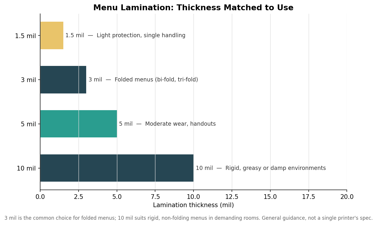
    Horizontal bar chart of menu lamination thickness in mil matched to typical use
    Lamination thickness matched to use: 3 mil for folded menus, 10 mil for rigid menus in demanding rooms.

    The second decision is lamination, which is what actually determines lifespan in a working dining room. As the chart shows, 3 mil is the common choice for menus that need to fold, thin enough to crease cleanly on a bi-fold or tri-fold. Step up to 10 mil for rigid, non-folding menus in greasy, damp, or high-traffic rooms where a menu takes real abuse. Lighter 1.5 mil suits menus you expect to reprint often, since paying for heavy protection on a menu you will replace in a month is money left on the table. Match the mil to how the menu lives, not to a vague sense that thicker is better.

    Putting it together by service style

    The right combination follows the room. A fine-dining restaurant with a curated list is well served by a single heavy letter or legal sheet on premium cover stock, lightly laminated or not at all, refreshed as the menu evolves. A fast-casual or family spot that hands the same menu to hundreds of guests a day wants a durable bi-fold or a rigid single sheet at 10 mil that shrugs off fingerprints and cleans with a wipe. A bar living on changing specials leans on a stable core menu plus 4.25 by 11 inserts and 4 by 6 table tents for anything that moves.

    Decide in that order, use to format to stock to lamination, and the menu fits your list, feels right in the hand, survives the room, and costs the right amount to keep current. The size that seemed like a throwaway choice turns out to shape the whole economics of keeping a menu on the table.

  • Laminated vs Synthetic Menus: Which Stock Survives Your Room

    Call or Text us: (929) 605-4397
    Specs

    Laminated vs Synthetic Menus: Which Stock Survives Your Room

    Two stocks, one decision

    Laminate and synthetic look similar on the table. Where they differ is how they fail — and where your menus actually spend the night decides which failure you will meet.

    How laminate fails

    A laminated menu is paper sealed between plastic films. Its weak point is the edge: once a corner splits, moisture wicks into the paper core, the sheet swells, and the menu is done. Indoors, that takes months of service. In a caddy of patio condensation, weeks.

    How synthetic fails

    It mostly does not. Synthetic stock is plastic through its full thickness, so there is no core to swell and no edge to seal. It can be torn with real effort and it scuffs eventually, but water — the thing that kills menus — does nothing to it.

    The price logic

    Laminate is cheaper per menu and perfect for dry dining rooms. Synthetic costs more up front and repays it anywhere wet: patios, pool bars, breweries, taprooms. Buying laminate for a beer garden is the expensive choice, whatever the invoice says.

    The simple rule

    If the menu lives where drinks sweat, go synthetic. If it lives on a dry table and gets wiped nightly, laminate is the value play. Either way the minimum order is 12 menus, the mockup is free within 24 hours, and production runs 2 weeks.

    Create your custom menus now.

    Send your logo, quantity and date — you’ll get a free mockup and quote within one business day.

    Get a Quote
    GET A QUOTE
  • Menu Design That Sells: What the Layout Is Quietly Doing

    Call or Text us: (929) 605-4397
    Business

    Menu Design That Sells: What the Layout Is Quietly Doing

    The page is a salesperson

    Two restaurants can serve the same dish at the same price and sell wildly different amounts of it. The difference is usually the page it sits on. A menu is read for about 100 seconds — the layout decides what those seconds land on.

    Put the margin where the eyes go

    Readers enter a menu at predictable points — the top of a panel, the first and last items of a list. Those slots are prime real estate. Put the dishes you want to sell there, not the ones you feel obliged to list.

    Kill the price column

    A neat column of prices with dotted leaders invites shopping by number. Setting the price quietly after the description, in the same size type, keeps the decision on the food. It is the single highest-leverage change most menus can make.

    Description length is a signal

    A short, concrete description outsells both a bare name and a paragraph. Name the technique or the source — one detail is enough. Long descriptions read as trying too hard, and nobody reads them past the first line.

    Print it like you mean it

    The best layout still fails on flimsy paper. Weight and finish are read by hand before the first word is read by eye. Send us your menu and your logo, and you will have a free mockup within 24 hours — minimum order 12 menus, production in 2 weeks.

    Create your custom menus now.

    Send your logo, quantity and date — you’ll get a free mockup and quote within one business day.

    Get a Quote
    GET A QUOTE
  • Custom Menus: A Buyer’s Guide

    Call or Text us: (929) 605-4397
    Buyer’s guide

    Custom Menus: A Buyer’s Guide

    The most-read thing you will ever print

    A menu is the one piece of print every single customer reads start to finish. Most restaurants spend less thought on it than on the napkins, then wonder why the specials do not move.

    Getting it right is two decisions: the right physical format for how the menu actually lives in your room, and a layout that steers the eye where the margin is. Both are cheaper to fix than a single slow week.

    Match the stock to the abuse

    Menus die of handling, not age. A dining room menu that gets wiped nightly wants laminate. A patio or bar menu that lives in condensation wants waterproof synthetic stock with no paper core to swell. A specials sheet that changes daily wants good uncoated paper you can afford to throw away.

    Layout is quiet salesmanship

    Eyes land in predictable places on a menu, and the dishes placed there sell more. Boxing a high-margin item, cutting the dotted leader lines that drag eyes to prices, and keeping descriptions short are old tricks because they work.

    Print enough to be generous

    Takeout menus only work if they leave the building by the hundred. At bulk prices the difference between ordering 200 and 1,000 is small, and every copy in a delivery bag is a standing advertisement in someone’s kitchen drawer.

    What to expect when you order

    Send your logo and your menu items. You will get a free mockup within 24 hours, unlimited free revisions, and you pay nothing until you approve it. Minimum order is 12 menus and production runs 2 weeks, with faster turnaround available on express shipping.

    Create your custom menus now.

    Send your logo, quantity and date — you’ll get a free mockup and quote within one business day.

    Get a Quote
    GET A QUOTE